top of page
Visual Concepts for Seasonal Sales
eCommerce / POS / Social Media / CRM / Screens

INTRODUCTION
The sale campaign takes place every year, running throughout the changing seasons. The concept is designed to align with the characteristics of each season—spring, summer, and winter—while maintaining a cohesive style throughout. The campaign is structured to reflect the mood and aesthetics of each season, ensuring a consistent theme across all marketing materials.
TIMELINE
Feb 2024 - Nov 2024
MY ROLE
Research, Concept Development, Presentation,
Design


CONCEPT/DESIGN BREAKDOWN
My concept was to develop a vibrant and playful advertisement for a sale that aligns seamlessly with the brand’s identity, ‘Never GrowUp.’ The goal was to create an engaging and dynamic visual that captures the brand’s youthful, energetic essence while maintaining a strong promotional impact.
COLOUR
Red is one of the brand's signature colours used in
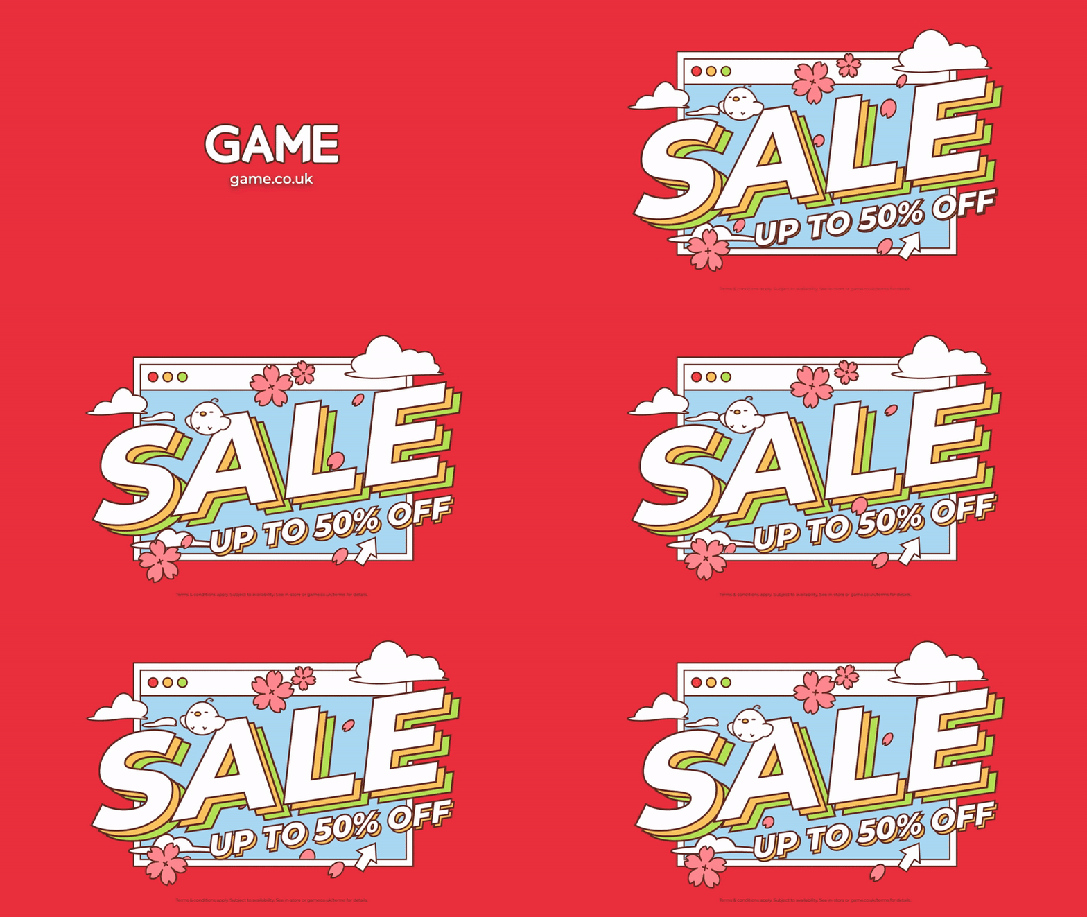
sale campaigns, ensuring consistency with previous promotions while maintaining high visibility. Spring
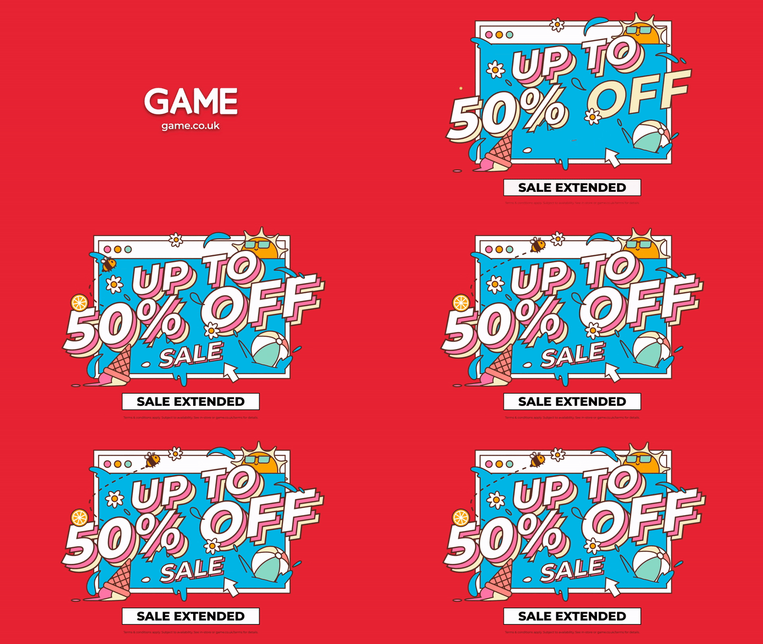
has soft pastels with dominant pink and a sky-blue background for a warm, fresh feel. Summer is vibrant and playful with bold, energetic tones. Winter uses muted browns, whites, and grays for a cool, neutral look. While I considered festive colors for winter, I
kept it versatile since the promotion extends into the New Year. This approach kept the design adaptable, maintaining a seasonal feel without limiting it to a specific festive occasion.
TYPOGRAPHY
The word 'SALE' was designed to be the dominant element, ensuring immediate recognition and visual impact. 'Montserrat' which is also the brand's key font was chosen to convey excitement, urgency and a
sense of fun, reflecting the brand's playful nature. The typography features layered effects, adding depth to the design and making it bold and eye-catching. The promotional message underneath appears smaller
but has similar impact with consistent design.
ILLUSTRATION
Inspired by the ‘Never Grow Up’ brand identity, the design features a lively, cartoon-style approach with fun and whimsical elements. Spring features cherry blossoms drifting across the sky, evoking a light and airy feel. Summer includes a prominent sun and ice cream, emphasizing warmth and heat. Winter is completed with snow, gloves, and a robin, capturing the essence of the season. These accents enhances the storytelling aspect of the sale. The hand-drawn and outlined look keeps the design casual, inviting and friendly, reinforcing the brand's youthful energy. The browser window frame in the background ties all the designs together, creating a cohesive identity for the series.

CONCEPT/DESIGN BREAKDOWN
Like the Spring, Summer, and Winter sale designs, this Black Friday version also uses scattered themed illustrations to reinforce its seasonal or event-based concept. Unlike traditional Black Friday designs that rely heavily on dark and minimal aesthetics, this design embraces neon-inspired elements to create a modern, eye-catching, and dynamic look.
COLOUR
While black serves as the primary background color (symbolising Black Friday). I chose to introduce bright, energetic colours to keep the design fun and visually exciting while still aligning with the Black Friday
theme. The neon color scheme creates a gaming and
tech-inspired aesthetic. The bright yellow is used for
the main lettering it’s one of the most attention-grabbing colors, especially against a dark
background. Many Black Friday advertisements tend
to use plain black backgrounds with white or red text, which can feel repetitive. This design breaks the norm by introducing a vibrant twist that feels modern, engaging, and distinctive.
TYPOGRAPHY
Different from the other sale designs, the typography has 3D effect that adds depth and impact, making the text appear elevated from the background, further increasing its visibility. The arrangement of the text layers makes it feel like the words are jumping off the screen, reinforcing the excitement and rush of Black Friday shopping.
ILLUSTRATION
The illustrative icons scattered around the design are directly inspired by gaming, tech, and pop culture, making the sale more appealing to a younger, digitally-savvy audience. All illustrations are outlined in neon colours against the black background, creating a retro-futuristic, cyberpunk-style aesthetic. The icons are flat yet dynamic, contributing to a minimalist yet engaging look without overpowering the main typography. The placement of the icons surrounding the text creates a sense of movement, guiding the viewer’s eye across the entire design. Small stars and geometric plus signs help fill negative space while subtly adding to the galactic, futuristic, and digital vibe.
MARKETING MATERIALS


Motion design by Elias Hope (in-house screen designer)

Vinyl poster displayed in Sports Direct, Bracknell

_jfif.jpg)
Vinyl header & Lightbox displayed in Sports Direct, Oxford Street
bottom of page
